A Vision of Christmas
Whether we like it or not Christmas is looming. In all its red-and-green, sparkle-laden, fear-inducing, festive glory, it is coming, and coming fast. I swear the department stores bring out their Christmas merchandise earlier every year, and every year I am shocked into Christmas-fear. Don’t get me wrong, I love the holiday season, but there is always so much ‘stuff’ to get through before you can just sit back, relax, and enjoy the celebrations.
One highlight of such celebrations is definitely the various carol functions. The music is always beautifully tear-jerking (especially those mass choirs of angelic-faced children) and the fireworks utterly spectacular. Disappointing then, in most cases, the branding is so god-awful.
When branding for a Christmas event there is always that danger of indulging in the stereotypical, expected, boring and totally over-done Christmas imagery– the glowing red-nosed reindeers, the kitschy Santa motifs, red and green baubles and, dare-I-mention the exploding presents– confetti, sparkles and streamers included. So, you can imagine how pleasantly surprised I was when I laid eyes on the Vision Australia Carols by Candlelight logo.

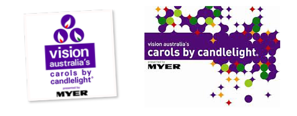
Vision Australia’s Carols by Candlelight logo from last year (2011) and this year (2012)
It is sparkly without glitter, Christmassy without the kitsch and oh-so classy. I love the use of regal purple and the confident use of lowercase lettering. Too many-a-time lowercase fonts have been used to in an attempt to be ‘cool’, only resulting in an unsophisticated, juvenile looking piece of graphic design. Used here, however, it sits beautifully alongside the bold Myers logo, and looks both modern and contemporary.
Getting back to the imagery– the spotted, cut-out jumble of circles and sparkles reminds me of going crazy with a hole-punch on a sheet of paper. I’m thinking confetti, sparkles, fireworks, celebrations and festivity. The pattern, in turn, draws clear parallels to the Vision Australia logo, in a very clever, subtle manner.
Vision Australia logo
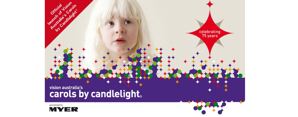
It speaks of an urban, festive celebration without the obvious Christmas icons. I love the bold use of colours and confident use of negative space– utilising the white background to make it part of the design rather than simply a canvas. Whatsmore this design can be applied in so many different ways as the pattern is so versatile in shape. It looks so lovely here overlaid onto an elongated photograph…
Looking at such a great piece of Graphic Design calms my jittery Christmas nerves and reminds me of the wonderful celebrations that are to come. There is no doubting the power of good graphic design, and the effect it has on people. It can bring cheer, hope and excitement and there is no better time than Christmas to spread such happy, positive feelings.
