Choosing a colour for your brand

When deciding on a colour for your brand, it is important that your colour palette is well thought out as the right colour choice can highlight your business’ strengths and help to attract the right customer. In design marketing, it is not uncommon for colour psychology to be discussed; a theory that argues how certain colours influence our emotions and behaviours through a variety of meanings associated with particular colours. It has been argued that a consumer’s reaction to colour appropriateness is far more important than the colour of the logo itself; does the colour of the brand live up to the personality of goods or service provided?
An excellent example of colour branding appropriateness is in the branding and marketing of organic skincare. Organic skincare businesses will often use a colour to showcase the personality and ethos of the goods they provide, in this case often a shade of green as it is often associated with being fresh and has ties to nature.
This colour branding is evident in the Australian brand Bontani Skincare who have chosen an olive green as the colour for their brand, which is appropriate given that their ethos and belief surrounds embracing natural beauty, purity, simplicity, and integrity. As a key ingredient in their product is olives, it makes sense that the use of green has contributed greatly towards constructing their organic, environmental and healing image.
As a tip, it should be noted that if you really want to stand out from your competition, why not choose a colour that is dramatically different from your largest competitor such as Go-To Skincare. This Australian business defies the stereotyping colour branding associated with organic skincare opting for a fresh soft peachy pink tone rather than utilising colours earthy colours such as green or brown often associated with the earth and nature.
The peachy tones used in their branding reflects the youthful playfulness and femininity that Go-To Skincare strive for in their business; it is a fresh take on organic skincare that stands out from its competitors.
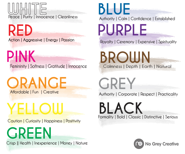
Despite the common associations with certain colours, it is far more important for the colours you choose to support the personality you want to convey rather than trying to align yourself with the stereotypical associations with colour as it generally comes down to context. Colours carry an array of different meanings which are generally subjective, based on learnt or biological meanings. The meaning and effect of a colour is often in direct correlation with context. Context is key when it comes to choosing your brand colour as depicted below; while a colour may mean one thing it can easily be related to something completely opposite.

What is most important when it comes to choosing a colour for your business is to not be afraid to experiment before making your final choice and remember that your colours should reflect a feeling, mood, or image that you want associated with your business. Be aware that you are not restricted to just one colour. The use of multiple colours in logos shows diversity with your brand, think of eBay for example. It should be noted that if your business operated internationally that you should consider the symbolic meanings of your colours in different cultures. In Western cultures for example, white is often symbolic of purity whereas in some Eastern cultures it symbolic for death. Just something to think about.
Remember: colour meaning and effect has to do with context
Ask yourself: what personality do I want my business to convey?
No Grey Creative offers Logo Design services, click below to see some of our recent work
View logos


