
Graphic Design finds from my recent trip to Tokyo
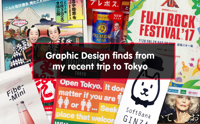
Japan is known as one of the most visually vibrant places on Earth and Tokyo is definitely a feast for the eyes! When it comes to Graphic Design, the city is an endless pool of inspiration bravely pushing the latest and even avant-garde trends. Brimming with colour, latest technology in combination with traditional imagery, the streets of Tokyo are quite overwhelming. For a curious cultural tourist like myself, this may just be the dream destination in which the most perfect scenes stand right next to the odd ones.
Since holidays are generally a relaxing time, I did not obsess with work. Still, I did find myself on a little adventure when it comes to Graphic Design. I enjoyed the abundance of commercial messages scattered all around the city and tried to pick out my favorite ones. Strolling through central wards of the Tokyo prefecture, I’ve come to notice that each of these areas has a different atmosphere. Design solutions presented in it fit into this specific atmosphere enhancing the local spirit, while still preserving a very Japanese idea of aesthetic.
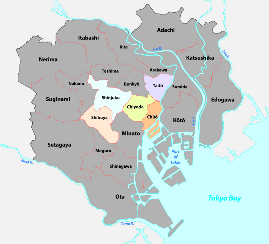
Highlighted are the 5 wards I’ll be taking you through in this article
Core of Tokyo is comprised of 23 municipalities known as special wards, each one of them referred to as “City” in English. Each of these boroughs is characterised by different local marks, from the type of architecture to the kind of dominant commercial activity. As you may imagine, each of these districts displays special Graphic Design solutions, reflecting its local culture and energy. So, allow me to take you on a small tour of Tokyo, hunting the most interesting visuals through its most popular wards.
Shibuya – An Explosion of Colour
Shibuya is one of the busiest wards of Tokyo. Tall modern skyscrapers are adorned with flashy advertisements, with neon and other signs popping out everywhere. This is the place where you can find both elegant cheap eateries, cool bars, record shops, nightclubs and lots of places to shop. In this bright, vibrant environment I uncovered some of the most colourful graphics. As an example, I chose the TimeOut Magazine cover for Japan and a Fuji Rock Festival 2017 announcement.
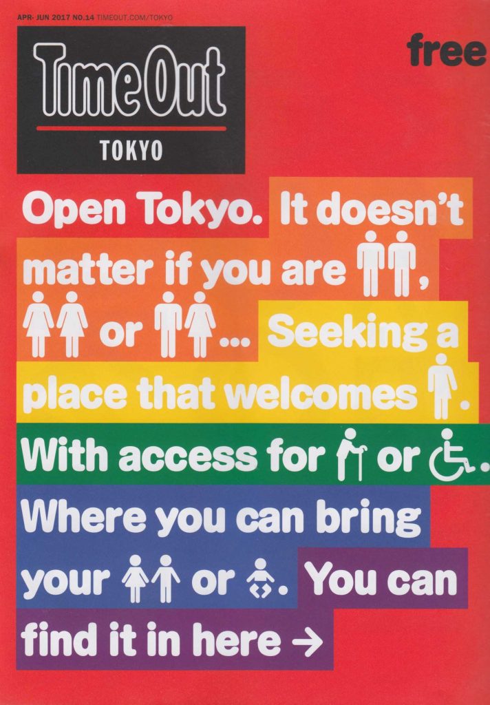
Cover of Time Out magazine in Tokyo: May 2017. Using bold colour trends
The first one is definitely an excellent example of the bold colour trend of the year, while the second (next to the pretty great lineup I might add!) is a youthful invitation to the free-spirited enriched with clean colours, illustrative simple shapes and simple, thick lettering.
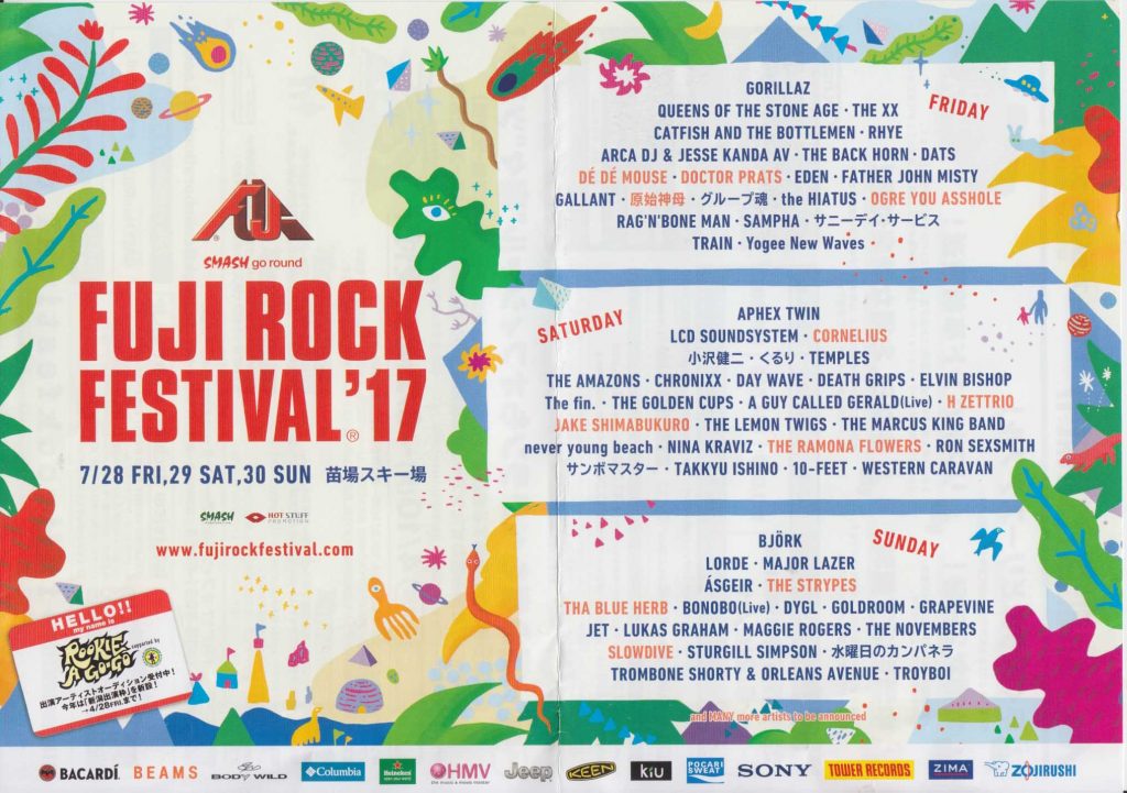
Fuji Rock Festival 2017 design – what a great line up!
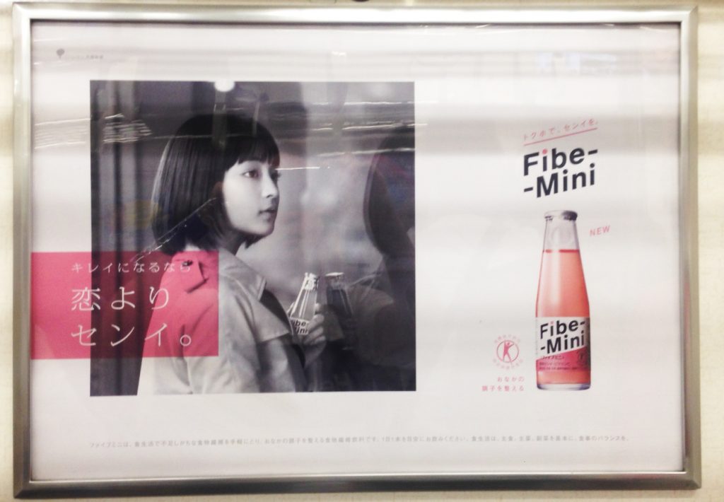
Shinjuku – the Entertainment Centre
Featuring everything a human might need, from great ramen to trendy art places, Shinjuku ward is known as an entertainment centre most of all. This area is the home to the Samurai Museum and even a Godzilla head (?!), among countless other attractions. What I found appealing is a very cute “hand drawn” flyer with information about restaurants in Shinjuku. It looks like an almost naive ad, created as a combination of drawing and collage. Hand-drawn graphics are actually one of the freshest trends in the logo design this year and it’s not a surprise the Japanese are using them already.
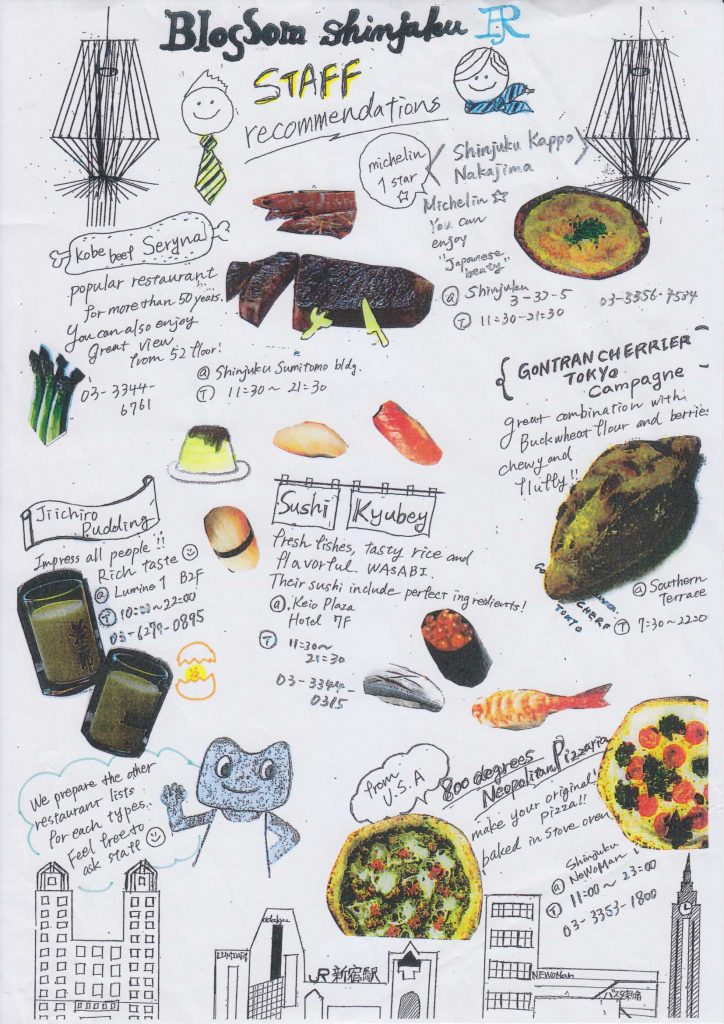
Using one of the freshest design trends ‘hand drawn’ – a cute flyer advertising different restaurants around the area of Shinjuku
Where Tradition Meets the Fun – Asakusa in Taito
Located within the smallest ward of the city, Asakusa is best known for the Senso-Ji, a Buddhist temple dedicated to Bodhisattva Kannon. There is more than one temple and many festivals in this picturesque area where tradition and futurism collide.
I believe this is best shown in this poster, probably for a performance or show or some kind, a busy picture of two overly-excited men in kimonos inviting the public to join them in what appears as the local Las Vegas. The retro style of this poster is actually quite progressive, since it combines bold colours, photography, illustration and hand-drawn design in what only appears to be a visual chaos, but is actually a graphic extravaganza.
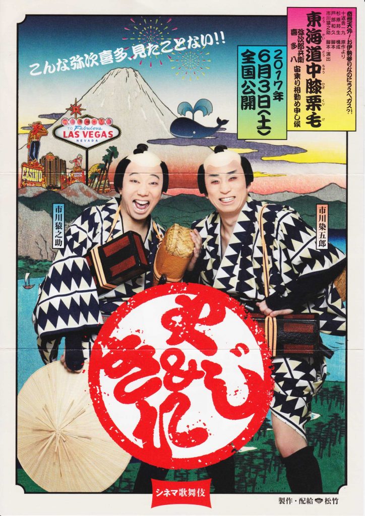
Combining tradition, bold colours, photography and illustration this poster is quintessentially Tokyo
Minimal Elegance in Ginza
Ginza is known as the posh area of Tokyo, a home to many designer department store and upscale restaurants and shops. Graphic Design solutions follow the atmosphere of the more elegant ward, featuring minimalism at its best. Black and white signs, simple, thick lettering and emblematic drawings are some of the characteristics of the commercial visuals located around Ginza. The signs I spotted give out a classic modern feeling combined with streamlined design.
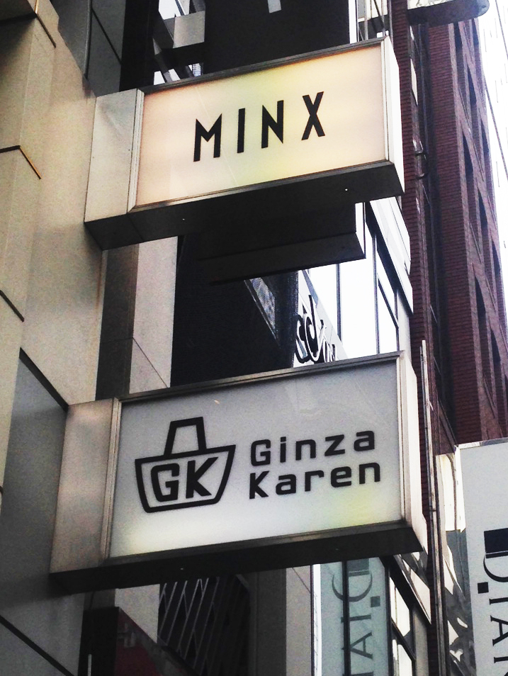
Cascading signage in the posh area of Gizna
Minimalist design for a restaurant in Ginza
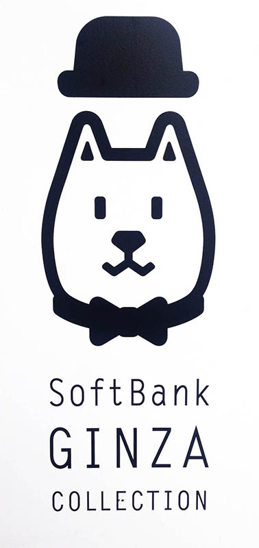
Even the Bank is stylish with its design in Ginza
Shopping in Shibuya – Omotesando Hills
In the area of a huge shopping complex of Omotesando Hills, I spotted a rather interesting poster. My interest in this visual piece came naturally as it shows how good graphic design can be understood without needing to know the language. The images, design and layout speak for themselves. Also, this is a very trendy solution since it uses vintage-looking photography and the overlapping effect.
A very clever design proving that good design knows no language barriers
Train Stations and the Spirit of Tokyo
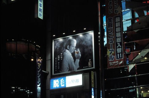
Train stations have a special place in the life and look of a metropolis and Tokyo is no different. These highly frequented traffic nodes are usually used as the perfect place for all types of commercials and people have witnessed a number of visually interesting campaigns over the years. This year, Persol launched a large-scale advertising campaign under the title “Work and Smile” featuring Steve Wozniak and Carmen Dell’Orefice as the iconic workers. Started in March, the campaign features a famous Japanese work culture, embellishing it with a “smile”. And age, it appears. From a Graphic Design point of view, these large billboards follow more than one of the trends of the year such as photography, minimalism and multiform typography.
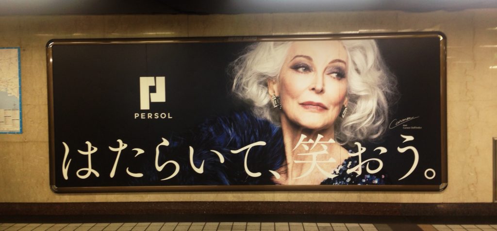
Carmen Dell’Orefice for Persol in Tokyo
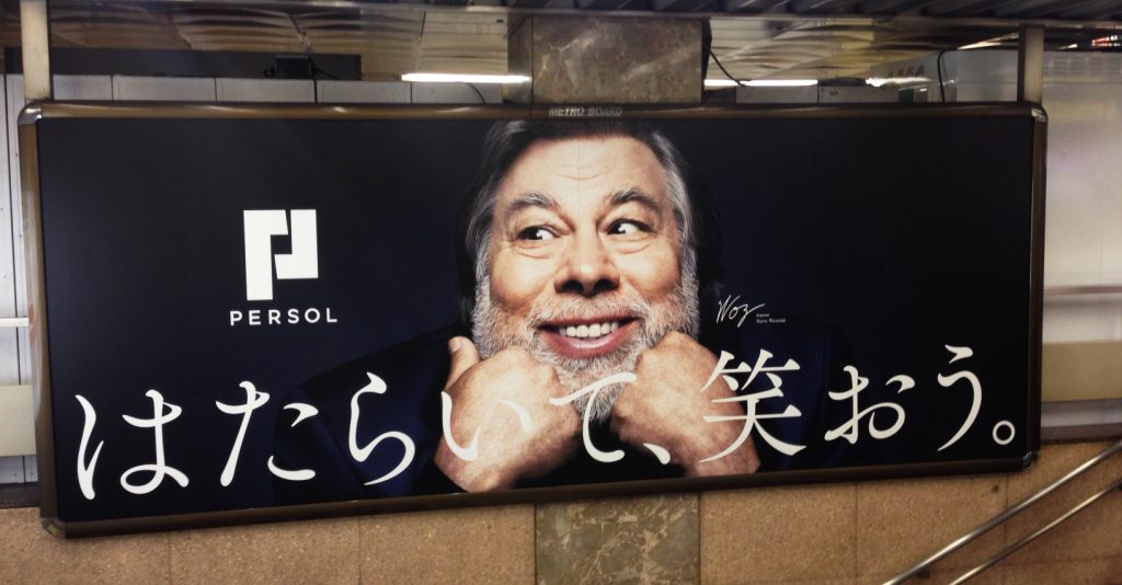
Steve Wozniak for Persol in Tokyo
Connecting the Dots across Tokyo – My very own Lost in Translation moment
It’s impossible not to be visually overwhelmed while in Japan. The place is a carnival of colour and light all presented through a diverse range of Graphic Design solutions. One of the general impressions that stayed with me is the number of vending machines – they are literally everywhere! Celebrities are also very popular as brand ambassadors and at the moment, the omnipresent face is the one belonging to Tommy Lee Jones endorsing Boss Coffee, a Suntory brand.
I could not help but compare the consuming presence of Mr. Jones to the character of Bill Murray from the movie “Lost in Translation”. His serious look and pose are all to similar to the one found in the said work of fiction, but I would like to leave the comparing of the two to you.
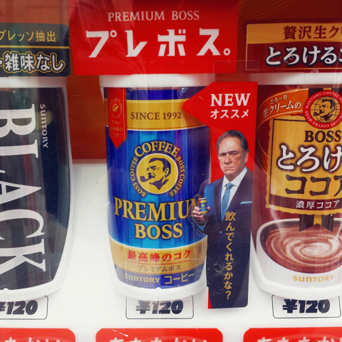
Tommy Lee Jones bringing to life the Lost in Translation character Bob Harris
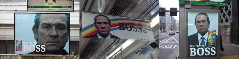
Anyone else feel a bit ‘Lost in Translation’?

Vending machines are everywhere! So they are a obvious choice for advertising
Bill Murray in the perhaps ‘not so fictional’ Lost in Translation movie
I hope you’ve enjoyed coming along for this very quick Graphic Design trip around Tokyo, maybe you’ve been inspired to book your next holiday there!
-
 That’s a wrap! – Open House Melbourne 2017
 -
 9 Designer’s Tips for the Perfect Business Card
 -
 Top logo design trends for 2016/2017 financial year
 -
 S U P E R G R A P H 2014
 -
 Jim’s Interior Design logo review
 -
 KolesWorth Supermarket