
Jim’s Interior Design logo review
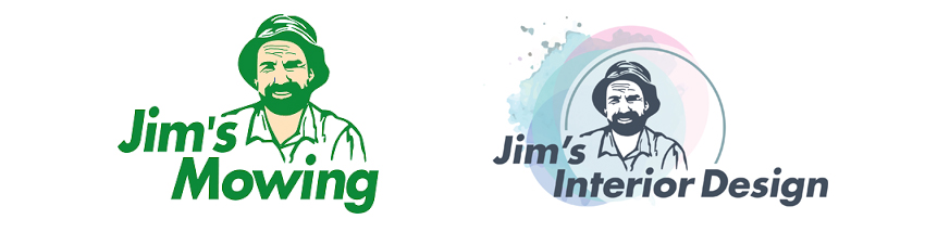
Where the world of delicate pastels and tough grass stains collide.
When I first saw this logo I wasn’t sure if it was real, but on further inspection, Jim’s Interior Design is in fact the new arm of the highly successful Jim’s Franchise Group. Jim’s is nothing less than ambitious and this attempt to break into the creative trade services is a bold, somewhat exciting new step, and I’m looking forward to seeing how it unfolds.
Being the first ‘creative’ arm of the business, I can imagine that the branding for Jim’s Interior Design would have come under much discussion of what direction the logo should take.
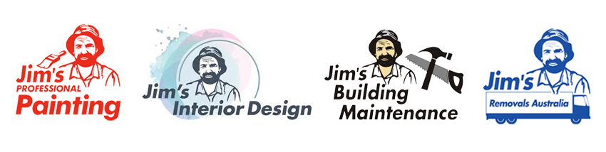
I’m sure when discussing the other new additions to the Group – Jim’s BBQ Cleaning and Jim’s Insulation Services – the solution was pretty straight forward: Jim’s trusty handyman-looking face next to the product and a font change… DONE!
Jim’s face suits the nature of these new additions to the highly successful franchise.
Whilst researching the Jim’s Group in more detail for this post, I was actually blown away by how many divisions the Jim’ Group has. I counted 45 if you can believe that!
Jim’s Interior Design is a natural extension or ‘add on’ for the customer, to their already existing services of Jim’s Removals, Jim’s Painting and Jim’s Building Maintenance to name the obvious few.
For years we have associated the face of Jim’s with somewhat dirty jobs, like cutting grass, bin cleaning, commercial cleaning and asbestos removal and his face certainly fits the logo. It’s a great design. He makes me think I’m hiring a man that is used to rolling his sleeves up and getting on with the job. But do you think it works for the creative, clean and ambient field of interior design?
Pick the odd one out!
The new logo uses beautiful pastels, soft circles and has a feminine appeal to it. Delving in further, the accompanying website has taken the same treatment and uses big beautiful images of interiors, and has a peaceful Parallax style homepage with loads of inspirational creative ideas for your home. To me, the logo and the website certainly paint the picture that if I engaged their services I would be getting a beautifully styled on-trend interior. I think they’ve nailed the brand treatment and message 100% – But that face and bucket hat is still looking at me through the pastels!
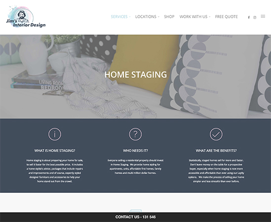
A snippet of the Jim’s Interior Design website
I’m still undecided about the logo myself, and I can imagine the predicament the graphic design team might have been in . I agree that it needs to have the face of Jim on there to establish credibility and trust, and without his face the business would be starting from scratch in gaining market value. On the other hand I can’t move past the vision in my head of a lawn mowing bloke coming to design my new parlour room.
I hope the man in the logo does’t leave grassy footprints over my new designer rug
What do you think of the new Jim’s Interior Design logo? I’d love to hear your thoughts!
-
 Choosing a colour for your brand
 -
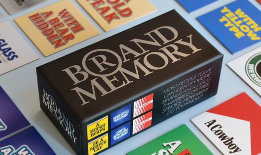 Brand Memory Game
 -
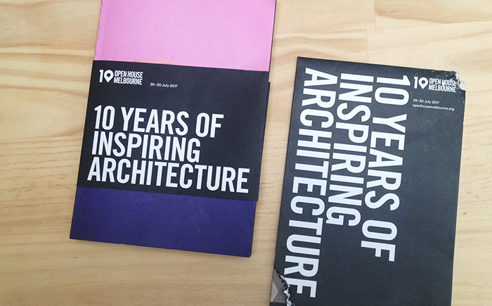 That’s a wrap! – Open House Melbourne 2017
 -
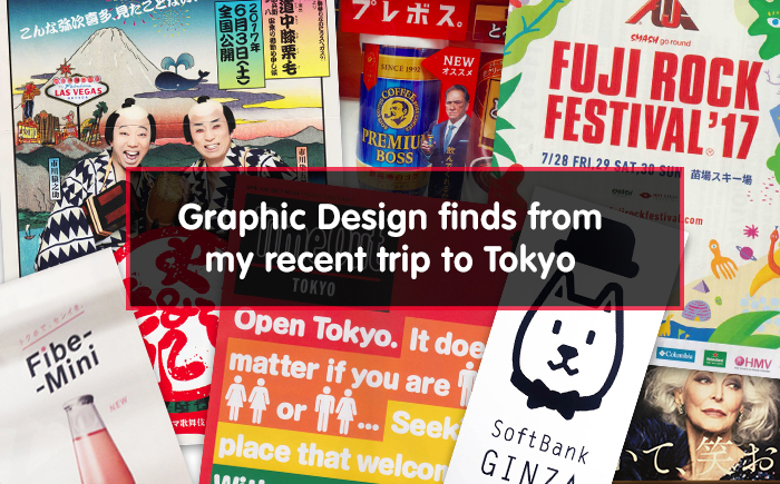 Graphic Design finds from my recent trip to Tokyo
 -
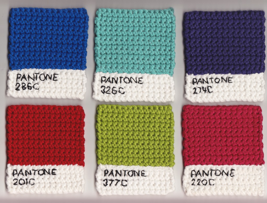 Pantone Knitted Swatches
 -
 I know that one!