Let’s go to Daiso!
For those of you unfamiliar with the joys of this Japanese emporium of $2.80 glory (yes everything packed into this mini Ikea-of-a-store is $2.80) then let me introduce you to my new favourite store– Daiso. Think $2 shop-cum-Ikea-cum-wonder emporium of Japanese greatness.
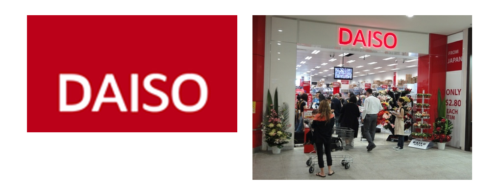
The Daiso store in Abbortsford
For this weeks blog entry I was given a task. Jacqui gave me an address with instructions to check out Daiso. Jacqui knows I have a slight obsession with Japanese packaging design, and am currently mothering a Hello Kitty infatuation. When I excitedly showed Jacqui my new Hello Kitty spongy iPhone case she said immediately “Oh my goodness, you HAVE to go to Daiso!!!” The added motivation of a researching for aforementioned blog entry was more than enough to get propel my enthusiasm. As I said before, Japanese packaging design has me doing back flips with excitement. I cannot get enough of the over saturated, over embellished, over-the-top labels– covered with cutsie characters and funny slogans like “Happy bear bath ball”. Last year as one of my Uni assignments I re-designed the Airoplane Jelly packaging for the Japanese market– the result; an explosion of Katakana, cartoon strawberries and cutsie doll-faced characters. Of my folio, it still remains one of my favourite pieces of design– albeit completely juvenile and pointless.
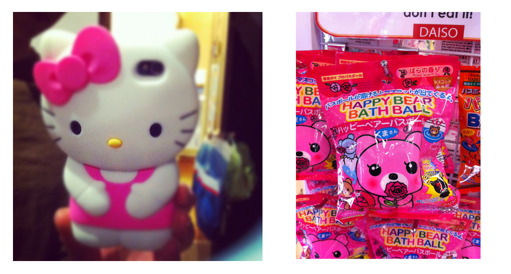
My Hello Kitty iPhone case
Anyway, back to Daiso!
Being rather spatially and directionally challenged, with the added reliance on public transport (yep, I’m one of those typical design students who hasn’t ever got around to learning to drive, let alone getting a licence) getting to the Abbotsford address was always going to be a challenge. Decked out with a blasted Myki and a photocopied page of the Melways I set off on my journey to Japanese wonderland. A train, tram and a brisk walk later, I managed without too much trouble to meander across town to, what turned out to be, the correct destination– Victoria Street Abbortsford. Go me! Who knew Victoria Street was such a Vietnamese Mecca! Certainly not me, and wandering past various Pho cafés, Vietnamese supermarkets, fish mongers, butchers and grocers was like being in Vietnam (sans the warm climate), was a great precursor for what was to come.
Fast forward 15 minutes and I found myself surrounded by walls, aisles and countless display counters of everything I love. Daiso was exacly the Japanese emporium I had hoped for. I think I actually gasped in delight as I walked through the doors. I proceeded to peruse the shelves for the next hour, trying to digest the vast array of products and rad design that surrounded me.
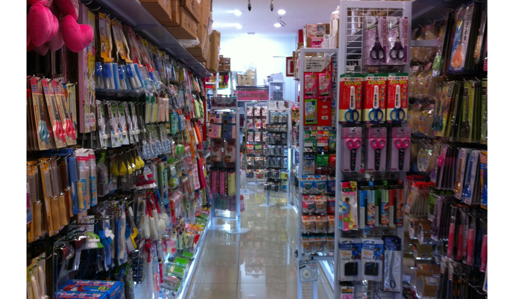
The stationary aisle in Daiso
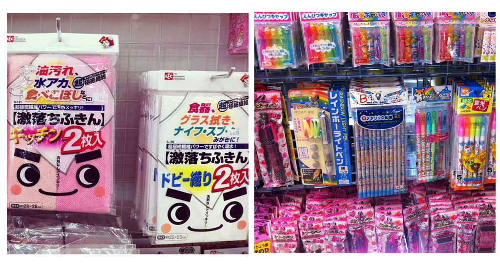
I think as graphic designers we all find pleasure in basking in the glory of ‘over the top design’. Usually we are limited by the conservative nature of our design jobs– designing logos for financial planners and websites for mortgage brokers doesn’t carry the same level of excitement as the colourful explosion of Japanese packaging design. In between the Helvetica-doused, neatly spaced, beautifully type-set jobs we need an outlet for wild exploration of colour, shape and form. For me, I find this pleasure in Japanese design– where the mantra seems to be the more colour, the more cute strawberries, the more cute little characters and bubble fonts the better. Everything one would usually associate with ‘bad design’ is crammed into the confines of candy, cleaning cloths, lunch boxes and phone pendant packages. In fact, most of the time the actual product cannot even be seen through the embellished packet, and with the added puzzlement of the all-Japanese labels, finding out what you have just purchased is always a source of surprise.

Cleaning cloths that would inspire even the most un-hygienic people to clean
After my hour of perusing delight, I managed to narrow down my purchases to a lunch box and bag– both pink and incredibly, dare-I-say, cute. I think in going to Daiso, one must have a purchasing agenda or purpose, because there is the risk of walking away with bags full of things you simple do not need. The universal $2.80 price-tag doesn’t help the temptation to buy absolutely everything. So if you are a compulsive buyer– prepare yourself! I in fact, needed a new insulated lunch bag, and the matching strawberry adorned lunch box was a necessary additional purchase.
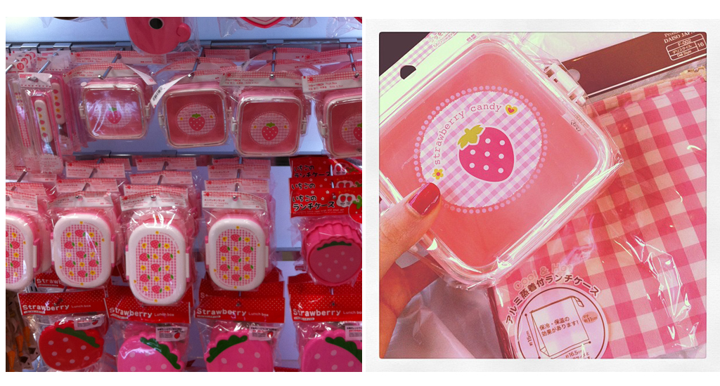
My purchases
So, all in all, my little excursion to Daiso was incredibly fun and productive (my new lunch-bag has already been put to use!). Only marred by the slight disappointing lack of Hello Kitty merchandise (eBay will have to continue to suffice in satisfying my infatuation), Daiso has become my go-to store for those moments of inspiration flatness. Because, despite the fact that clients are unlikely to request a pink, smiley faced, sparkle embellished logo, Japanese package design reminds us that we don’t always have to be limited to the conservative nature of Helvetica and mono-tonal colour schemes. Surprising dashes of colour, interesting layouts and taking a slightly different approach to a design can lead to a unique and rewarding outcome. Design does not have to be boring, even if the brief suggests a boring outcome– there is always an outlet for unexpected creativity and flair! I think the most important thing is to keep an open mind to the endless possibilities of design and not to be influence by what is expected.
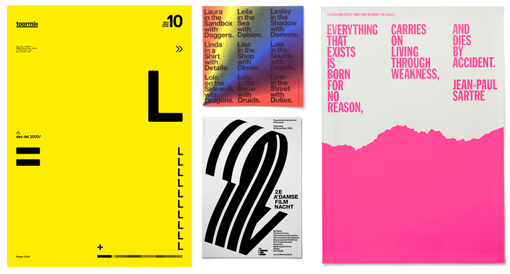
Design agency, Experimental Jetset, use Helvetica and apply formal design conventions, however add that little twist of kookiness– the results are both visually surprising and graphically effective.
For clients, opting for something different, unexpected and unique can be a risk, and quite daunting, but it can be the difference between being noticed and blending into the crowd. As designers, we will often present you, as a client with three ideas, one for the client, one for the designer and an amalgamation of the two. So next time, consider the whacky, unexpected idea– even just take elements of it and add it to what you already know. You will surprised just how exciting the resulting design can be!