Raised in a Foster’s Friendship
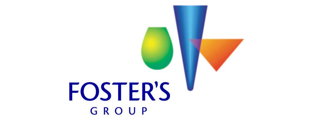
Shocking isn’t it? The sight of those gaudy, gradated phantom-like pitchers floating precariously above the poorly kerned type is enough to turn any graphic designers stomach. The relevance of which I still am struggling to understand – apparently they represent a wine, beer and martini glass, but really, who knows?
I have been meaning to let off some steam on The Foster’s Group ‘new’ logo for some time now, and am slightly embarrassed to say, that I wasn’t even aware that it has since been updated (thankfully) for something much less, well, horrible.
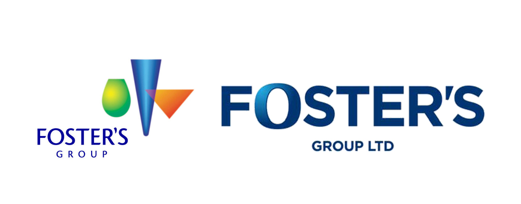
Foster’s Group logo old vs new
The relatively short life span of the old logo (I reckon its been around for less than 12 months!) is totally understandable. The childlike use of gradients (which are startlingly similar to those you can create in WordArt) totally undermines the corporate-feel of the company. The decision to use such a ‘soft’ typeface is also rather questionable. Surely The Foster’s Group want to portray themselves as the ‘global premium-branded beverage company dedicated to delivering quality products enjoyed by millions’ they describe themselves as?
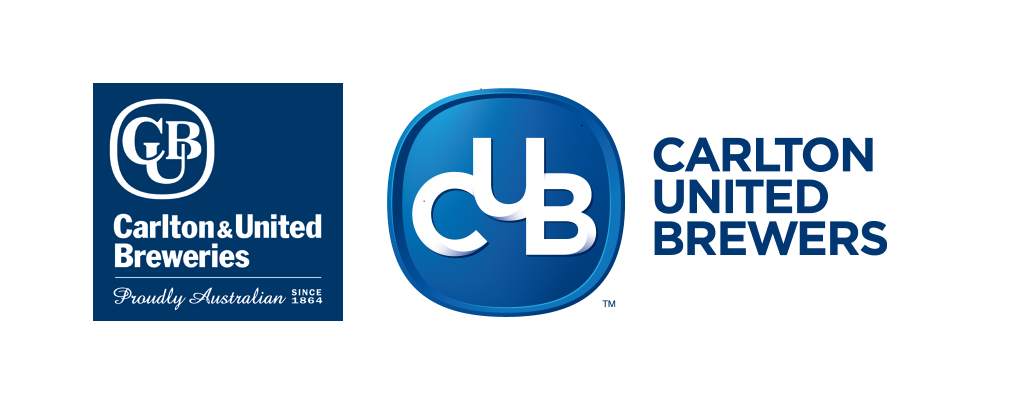
CUB logo old vs. new
Well, luckily for us, and for The Foster’s Group, the floating-pitchers monstrosity has been scrapped – replaced (and hopefully forgotten) by a much more conservative and corporate looking, type-dominated logo.
The ‘O’ from the iconic and classic Fosters beer logo sits amongst strong and bold lettering, making for a logo, which, not only aligns with the strong corporate image of the global beverage company, but also draws parallels to the recently updated logo for Carlton & United Breweries (which, has also been renamed as Carlton United Brewers) – the groups domestic subsidiary. In fact, the two newbie logos were released simultaneously, as a part of the duos new-look campaign, following their separation with former wine partner Treasury Wine Estates. I mean who wouldn’t want a new look after a messy break-up – if anything, just to make yourself feel better!
According to a press release the refreshed logos for both Foster’s and CUB complement the new name and beliefs and reflect a business with an exciting future. More exciting than brightly coloured pitchers? I think so!
The new slogan “Raised in Friendship”, makes me think all warm and fuzzy thoughts – maybe they should call themselves The Foster’s Family?
Jokes aside, I think the choice to dispense with the old, almost laughable, logo was more than justified. It’s replacement wordmark is simple and to-the-point, graphically mocking the juvenile irrelevance of the previous design. Let’s just hope that the visual horror that was the old logo isn’t too etched in everyone’s mind to move forward to the afore-promised ‘exciting future’.
Perhaps we can all have a laugh about it later over a beer. As long as it’s not served out of a poorly rendered, blue beer glass I’m happy!