
Ray’s Outdoors rebrand
For decades, Ray’s Outdoors has been an essential checkpoint for many Australian outdoorsmen (and women). Regular customers and those sensitive to aesthetics must have noticed the current rebrand featuring a bold font and a completely new colour scheme. In October 2015, the “Australia’s best outdoor leisure retailer” got a makeover, introducing a new website and e-commerce system, and a chain of freshly refurbished stores. The famous retailer is now known as “Rays”, a place for those who “camp, paddle, hike [and] explore”.
According to Super Retail Group (purchased Ray’s Outdoors in 2010) chief executive Peter Birtles, the reason behind the massive rebranding was of financial nature. The stores, although well stocked and relatively popular, weren’t performing. The new concept and look will now allow Rays to compete with the hip Kiwi Kathmandu, widening their offer and making it more appealing to the new generation of adventurers.
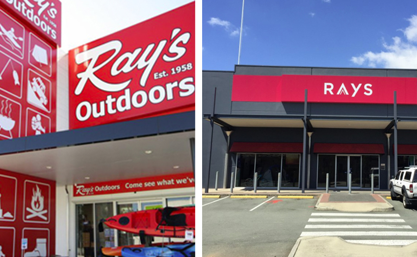
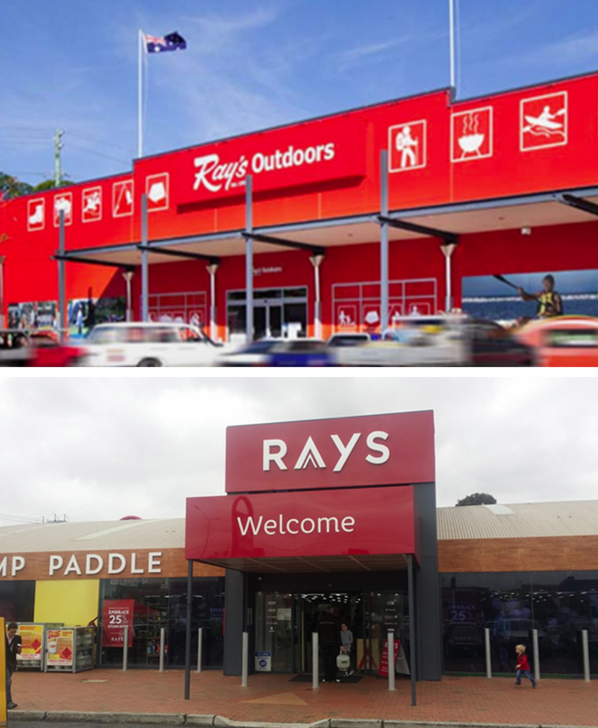
Looking at the old Ray’s Outdoors logo, we can say that a change was long overdue. The semi-cursive white lettering on a generic vermilion looked rather outdated than retro. The look followed the late 50s style to a degree, without following the trends in logo design very much. Ultimately, it didn’t do anything for the contemporary shopper, a person used to good design and quality goods at the same time.
![]()
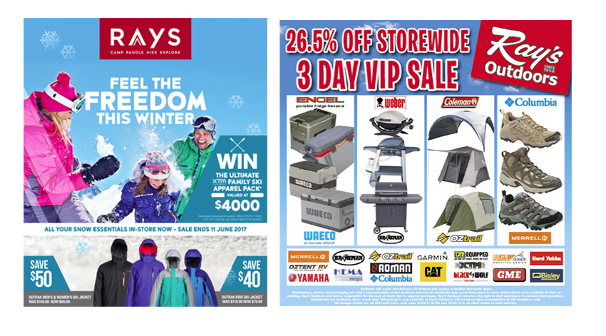
The new concept is highlighted with elegant burgundy backdrop, supporting both the logo and other visual content coming from the brand. The logo abandoned the dated cursive, now turned into a geometric, sans-serif “Rays”, losing the apostrophe and adding an “A” resembling a stylised mountain peak. The result is an upmarket, sleek and modern solution, in line with current market aesthetics. Along with the burgundy theme and the new logo, Rays added a concept-related texture resembling natural wood, appearing throughout the new shops, but also in a number of visual solutions including digital ads and offers. The final message is clear – it’s on trend to be outdoors and in touch with nature.
After Super Retail purchased Rays in 2010, the brand suffered a serious drop in earnings. The rebranding action was taken in order to keep working in that specific portion of the market, while making the chain profitable. Out of 55 Ray’s Outdoors stores, the new concept was first tested in five, and then implemented in 12 more. The plan disclosed in 2016 was to convert 23 of the remaining stores to another brand and to either close and rebrand others. The expense of the restructuring were very high, amounting to $43 million in one-off costs. This included $28.5 million in cash costs and $14.5 million in non-cash charges and writedowns.

For Rays itself, the change of the concept resulted in better performance. Besides downsizing of the chain, a significant sum went into rebranding and refurbishing, including the new design and website. Rather than shutting down the brand or cutting costs, Super Retail decided to present Rays in a new way, allocating significant funds to marketing and proving once again its importance.
It’s a known fact that it’s healthy for a business to refresh their logo and the concept periodically. We believe that the action Super Retail took was a sign of smart business evolution, hoping the investment was worth it. We hope this operation will help Rays to stay open and the new look will certainly help keeping the brand in vogue!
-
 That’s a wrap! – Open House Melbourne 2017
 -
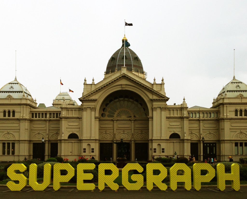 S U P E R G R A P H 2014
 -
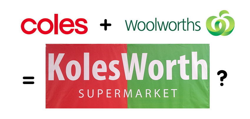 KolesWorth Supermarket
 -
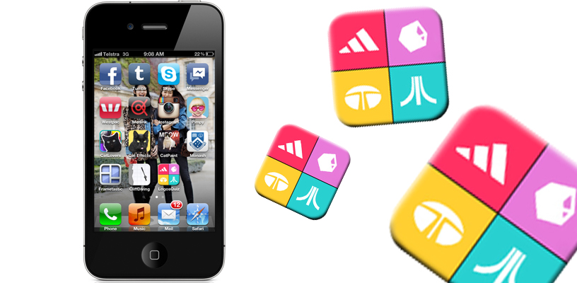 I know that one!
 -
 9 Designer’s Tips for the Perfect Business Card
 -
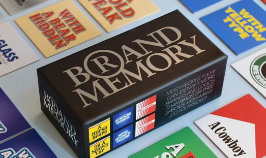 Brand Memory Game