
Top logo design trends for 2016/2017 financial year
When it comes to branding, an impeccable name can only be supported by a perfect logo. Many global companies don’t change their logo for long periods of time, considering it flawless and perfectly recognisable. However, even the biggest of multinational enterprises decide to give their visual identity a touch-up. Among those big names are Mastercard and Google, but also Coca-Cola, with their frequent stunts and refreshments in visual identity.
When it comes to small business owners, logos can make or break their brand. So, it’s crucial to come up with a solid design to begin with and not give in to too-frequent changes. Still, revitalisation of the brand and the logo is necessary from time to time and if 2017 is that time for you, you are in luck! Looking at all the logo design trends for this year, we see they are brimming with dynamic changes, bringing back some of the retro flare in mix with contemporary proclivity for pure visuals.
What we’ve seen in the past months are new logos that are cleaner, simpler and stronger in colour and very diverse.
Bearing the nature of the business behind the logo in mind, we’ve endeavoured to identify some of the most notable logo design trends of 2016 / 2017 financial year.
Gradients are In!
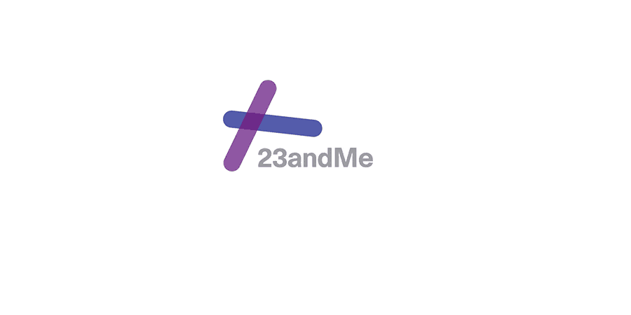
One of the most exciting trends in logo design this year must be the use of gradients! Irresistibly retro, gradients offer a sea of possibilities to all designers keen on colour and overlapping elements. Having experimented with different nuances over the years, Telstra is currently employing a brightly coloured logo on a gradient background. An even bolder and livelier solution came from the Small Business Festival Victoria, in the form of a multicoloured background with simple writing and a geometric Victoria logo in the lower right corner. We look forward to seeing all the solutions that will come out of this trend.
Sourced examples of logos using gradients:
![]()
Minimalism
After Mastercard and Airbnb changed their dated logos to much cleaner images, it was clear that a trend of form simplification is here. A general tendency to reduce trademark signs to bare essentials followed by simple brand name is running globally, followed by a similar reduction of the colour palette. Some of the companies even went so far to banish colour altogether and return to the pure black & white text, following a rather progressive minimalist drift.
Sourced examples of minimalist logos:
![]()
![]()
Kinetic Logo Design (GIF’S)
The digital world opened up the possibility of having a dynamic logotype and making a gif today is simpler than ever. It’s not a surprise that moving parts and gifs are one of the focal logo design trends of 2017, challenging the imagination of designers to the fullest. These constantly changing pictures automatically provide more than one static solution, and serve as the most charming and attention grabbing signs on the web.
Sourced examples of logos as a animated GIF:
![]()
![]()
Multiform Typography
Since a logotype is inherently bound to the name of the brand, typographical experiments are a natural part of graphic design. This year brought a somewhat odd approach to typography, incorporating different methods – from letter stacking, cropping, stencil fonts and broken letters, to the return of sans serif and the Google fonts. Even though most of the logos are made digitally and viewed mostly online, the typographical solutions are always looking their best in print!
Sourced examples of logos using typography:
![]()
![]()
![]()
Light and Bright Colour
Colour can indeed become the prime carrier of the brand identity and 2017 is proving to be the year of clean, bright and bold nuances in graphic design. General duotone trend in graphic design is reflected in logo design as well, whereas primary colours and combination of intense hues defines the trend. It’s interesting that this chromatic opulence appears in all shapes and forms, in combination with other logo design trends, from minimalism, over linear work, to hand drawn vintage signs.
Sourced examples of logos using bright colours:
![]()
![]()
Back to Geometry
Geometry is one of the most essential elements in graphic arts, so it’s no wonder it is an ever present trend in logo design. Geometric approach is more prominent this year, as some designers break the fluidity of letters or forms into angular shapes. This trend also supports the return to 80s-like modernist and retro style in logo design, as well as the use of grids, patterns and repetition. Some of the less abstract, but still geometrical solutions show a rather flat quality, frequently enlivened with the choice of vivid colour. To be fair, geometric logo design trend is here to stay, but the approach of the moment dictates combinations with minimalism, colour, simple lines and interesting lettering.
Sourced examples of geometric logos:
![]()
![]()
Line Art
As a shout-out to the almighty line, logo design trends of 2017 bring a fresh approach to the use of this fundamental visual element. Evoking the art of drawing, lines are guided to describe simple pictures, letters, abstract shapes or even more elaborate forms. A unifying quality is the thin, unbroken line that describes the image.
Sourced examples of logos using line art:
![]()
Organic Graphism
Hand-drawn images didn’t reach their peak yet, but they are slowly coming up to it. While it was a complicated thing to transfer handwriting and jotted croquis to a digital form a while ago, it’s become a very easy thing to do today. This technological advancement prompted a new trend in graphic and logo design, which includes very unique fonts and images, infusing it with warmth and vicinity of a very personalized approach.
Sourced examples of organic style logos:
![]()
![]()
Negative Space
A minor trend, but a very powerful one. The use of negative space in logo design opens the possibility of a double message – often a lettered and a visual one embodied in one image. Characteristic of this approach are the simplicity in form and reduced use of colour, as well as a clever method of uniting two images into one.
Sourced examples of logos using negative space:
![]()
![]()
A Shout-Out to Vintage
Not the most prominent trend, a vintage approach to graphic solutions is still very much present. It can range from simple geometric homages to earlier logos, to shabby-looking emulation of old sign painting. It’s strength is in the retro font and simple palette, often imitating patina.
Sourced examples of vintage logos:
![]()
Finally, when thinking about your future logo or a redesign of your present brand identity, it’s important to keep in mind that originality is always valued more than any trend.
If you like any of the styles above, we can help you in finding the perfect combination of visuals for your brand. We at No Grey Creative take pleasure in learning about your business and putting together the ideal design solution just for you.
Click below to see some of our recent Logo Design work
CLICK HERE TO VIEW OUR LOGOS-
 I know that one!
 -
 9 Designer’s Tips for the Perfect Business Card
 -
 Brand Memory Game
 -
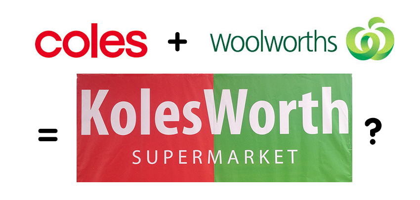 KolesWorth Supermarket
 -
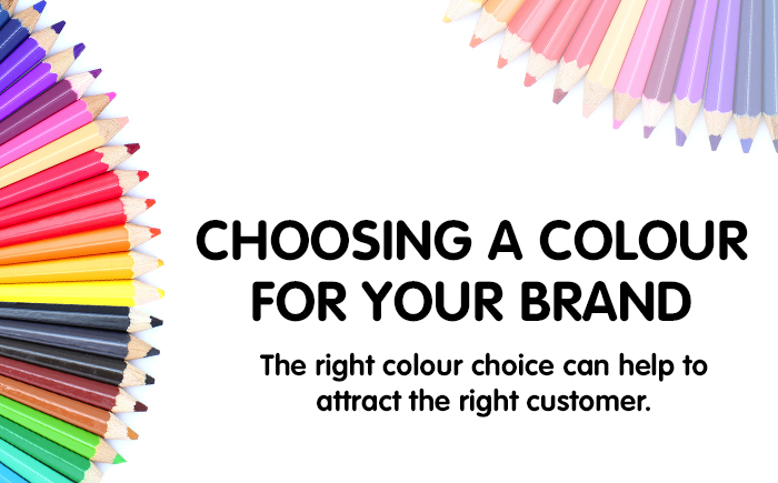 Choosing a colour for your brand
 -
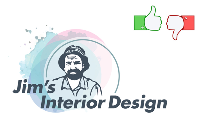 Jim’s Interior Design logo review