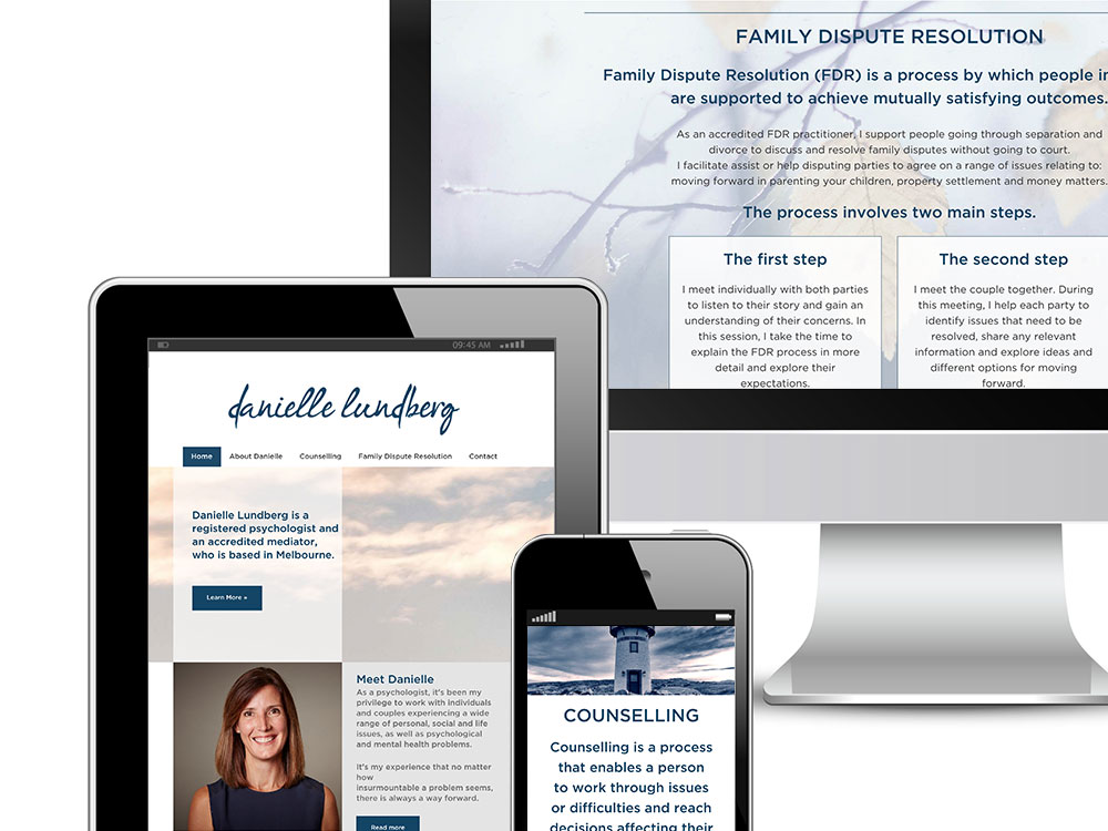
Rush & Hampshire Solicitors
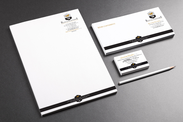
Logo design for Lawyers, Rush and Hampshire
More often than not, a client has some sort of idea about the type of imagery they’re looking for in their logo and Geraldine of Rush and Hampshire was no exception. In fact, her brief was very clear; she wanted a logo that looked like a family crest.
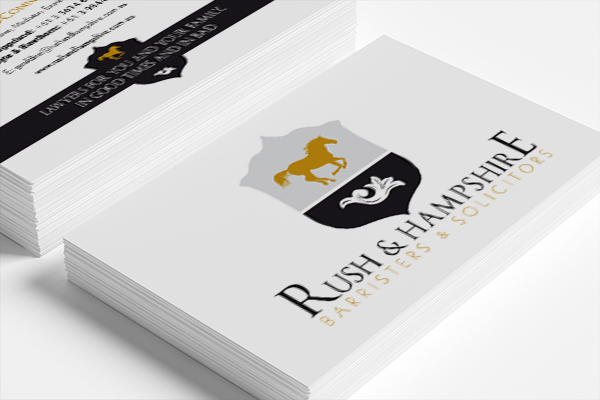
Business card design for Warrandyte based, Rush and Hampshire
Geraldine’s successful legal practice is based in the picturesque outer suburb of Warrandyte in Melbourne’s east and she really wanted to play on the rural ‘countrified’ geographical location of her business.
We had to do heaps of research on family crests to make this logo work and we used the traditional colours of black and gold to add that ‘landed gentry’ look and feel. But we reckon we got it right.
The end result brings together Geraldine’s various loves − horse riding, theatre and genealogy − and ties them up nicely in a suitably ‘crest-like’ design.
We then rolled out the logo onto all the usual suspects including business card design, letterheads and with compliments slips.


