Kent and Co Property Valuers
Logo design for Kent and Co in Geelong
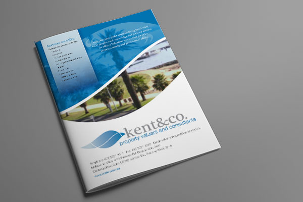
Information brochure design for Geelong based Kent and Co
Kent & Co is a Geelong-based property valuation service that’s been around for a while, so this job was all about refreshing their brand to give it a contemporary look and feel. The old logo included a wave shape, originally chosen to emphasise the geographical location of this Surf Coast business.
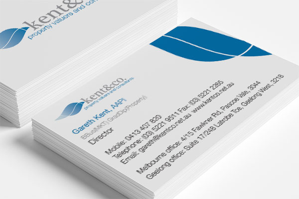
Business card design for Gareth Kent
We felt the wave devise was still a great tool, but that it could be reworked to make it more versatile. We created a whole suite of marketing materials in the end, sometimes using the shape as it appears here in the logo, sometimes using it facing downwards and sometimes using just a hint of the curve as a cool cut out.
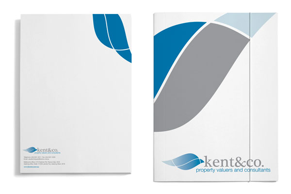
Corporate stationery design for Kent and Co
The branding and marketing material has certainly brought Kent & Co into a new era, and customers often comment on how great their branding looks.