Milkbar Digital Re-brand
After opening its doors in 2015, Milkbar Digital has celebrated success after success and has grown to become one of Prahran’s premier digital agencies. Priding itself on creating high quality creative content with advertising strategies and campaigns that deliver above and beyond ROI for their ever growing client list.
![]()
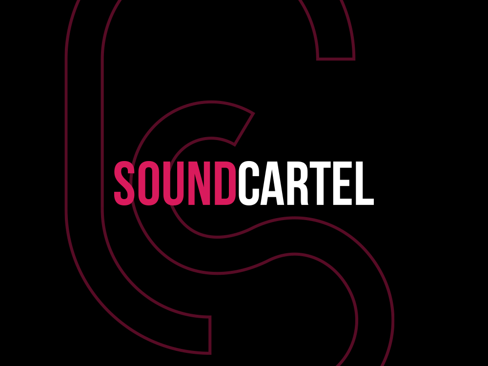
Logo re-brand for Prahran digital agency, Milkbar Digital
At No Grey Creative, we have had such privilege to be their branding partner from day one and when the discussion of a much needed re-brand was floated we were once again excited to be onboard.
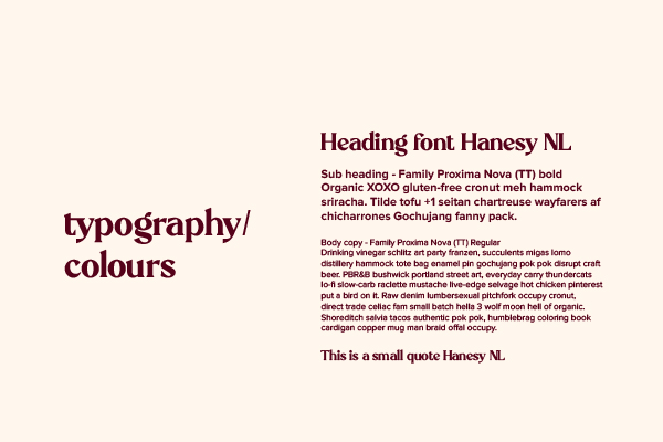
Brand bible for typography
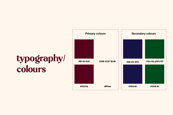
Brand bible for colour rules

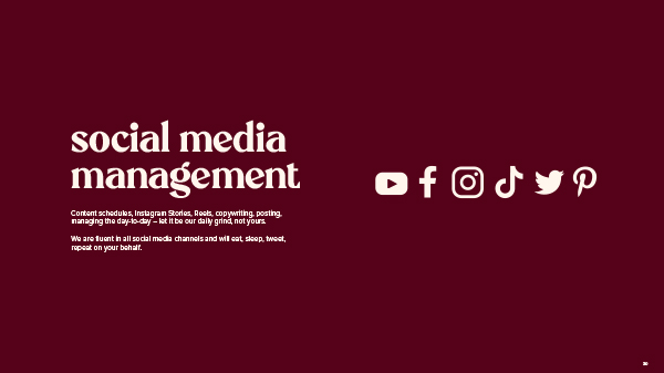
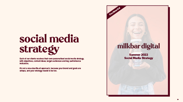
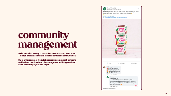
Social media concepts for Milkbar Digital
Our brief was to bring the look and feel of the business into a more mature and agency like era. When compared with the original brand created in 2015 (click here to see) we achieved this by doing away with the millennial pink, gold trimmings and casual typeface which were no longer relevant to the brands more established persona. Replacing this with a stylish maroon colour which pays homage to the brands pink beginnings – a ‘grown up’ pink if you will – paired with a subtle cream tint. The typography took on a bold serif typeface to completely change the impression of the brand and is coupled with a modern sans serif for accompanying body text and assets.
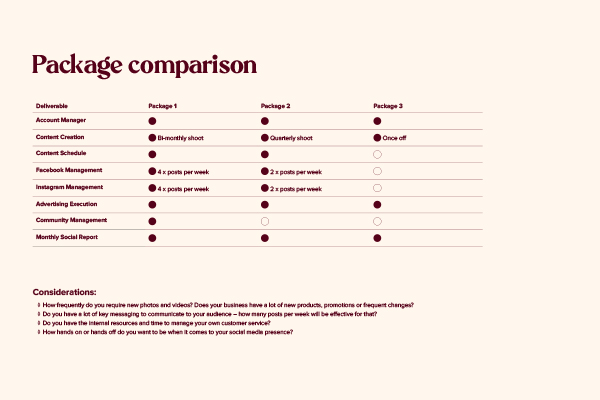
Business packages document
Agency credentials
Agency credentials
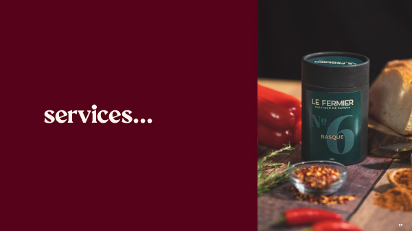
Agency credentials
Agency credentials
A re-brand of an established business is no small undertaking and requires not only a logo but a whole suite of assets over time to pull it all together. We love how this project has turned out and are enjoying watching the brand vision come to life with each new day.
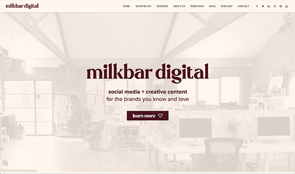
Website homepage re-brand
![]()
Icon logo version
![]()
Milkbar Digital re-branded logo design